
Published 24 September 2018 in Brand Development
We were asked by ATS Euromaster to create a standalone brand for their call centre covering its commercial and fleet recovery and breakdown business.
The organisation covered not only company fleet car policies but also lorries, heavy haulage, even farming vehicles. This, therefore covered a broad range of commerical expertise and knowledge that needed to be at the heart of the organisation from the call centre staff through to the breakdown engineers themselves.
We set about thinking how all these layers of expertise and services could come together in one succinct brand but which also had a link to the ATS Euromaster brand. From these explorations we came with ‘ A safe pair of hands ‘ as a route to explore and what this meant to consumers in their everyday.

A Safe pairs of hands is a person you can rely on, a person who’ll get the job done, and a person you can trust. So how does that person resonate as a brand to todays diverse consumer? We then distilled this thinking into the word 'Go-To'. In life we have 'Go-To' people that we have for all our little emergencies when we don’t know what to do. We felt this gave the brand personality, honesty and above all relevance to todays consumer. To align it into the ATS euromaster brand we used the secondary sign off of ‘putting you in good hands’. ATS sign off is You’re in good hands’ and therefore this completed the link.
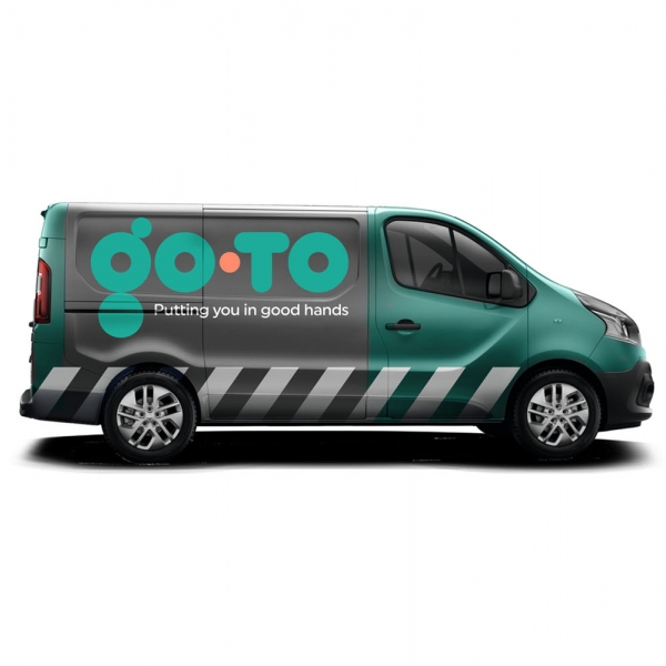
In terms of execution of the logo we wanted to create something distinctive and eye-catching. The logo iteself is made up of all different circles to represent wheels from all different vehicles. The way these interact are all perfectly weighted and spaced to create real harmony which in turn brings confidence to the brand. Colours were influenced by the current market and who owned what colourspace. We then rationalised what the remaining colours reflected and how these sat with the ‘Go-To’ brand.
The palette we chose was predominantly Aqua green which reflects modernity and is seen as honest, safe with an element of environmental credentials. The grey reflects professionalism and reliability and we used a sprinkling of dayglo orange in the dot to represent dynamism, creativity and expertise.
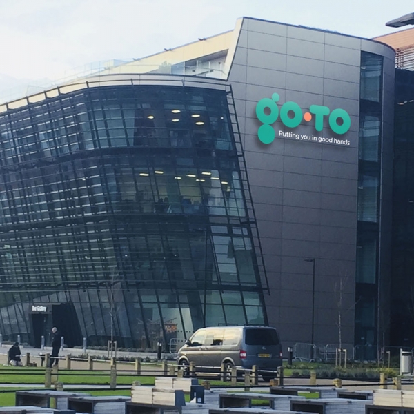
Everything about this logo and the naming convention to it reflects our deeper thinking and passion for creating brands that have meaning, relevance and ultimately make sense to the consumer. The brand has been translated into not only the call centre branding but into uniforms, call centre interior and vehicle livery.
Published 24 September 2018 in Brand Development